in government research
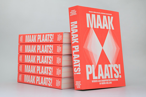
The first time we started talking about Maak Plaats! was in 2012, when it was in its research phase. A year later, we started working on a small version of the publication, where we designed some diagrams and used text to explore the possibilities for a complete publication. As more data arrived, and the Province of Holland decided to use the research as the foundation for their future policies on infrastructure there was more reason for the organisation to develop the idea further into 'Maak Plaats' - a brand, a 400-page publication and a conference.
It was quite a natural process that evolved into a series of works commissioned by the Province of Noord-Holland. Vereniging Deltametropool (a research institute on developing metropoles in The Netherlands) conducted research on infrastructure in collaboration with APPM (management consultants). Alfons had developed a great relationship with Vereniging Deltametropool having collaborated with them on many other projects, which led to the commission
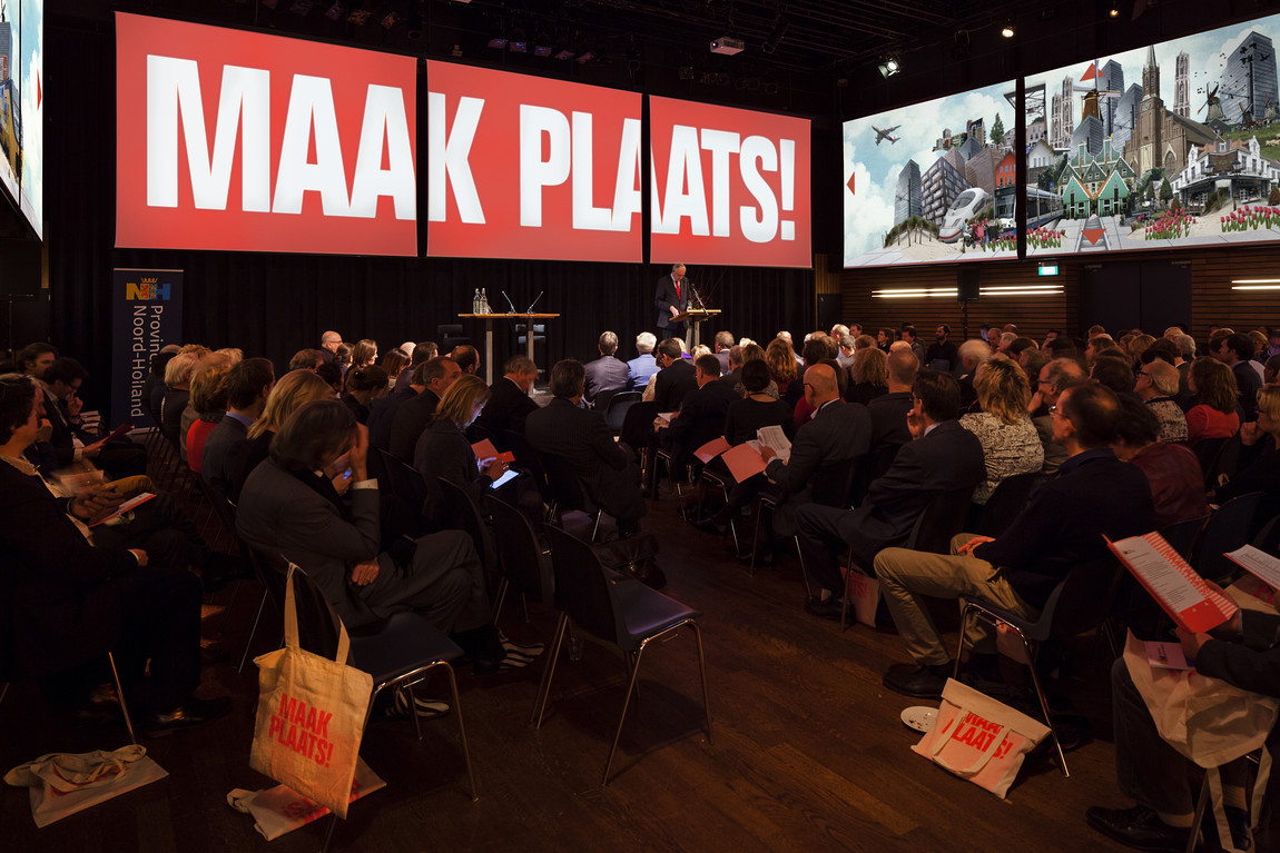
We worked closely with the Dutch government to achieve the end-result and the success of the collaboration really came through. Again, the process was quite organic and what we enjoyed was their openness to ideas and possibilities for the branding. The fact that the project evolved into 'Maak Plaats' is a sign of their enthusiasm and belief in the strategies.
At one point we proposed to divide the text into three layers - activating, informing and explaining - to create a more readable and engaging relationship between content and design. The layers have a specific typographic and infographic treatment and in order to make this work, it was necessary to revisit the text to fit it into the new identity. The Dutch Government supported this design decision, producing updated text to complete the concept. For us, this was something special as we felt that they wanted to push the project to its conceptual limits, as did we.
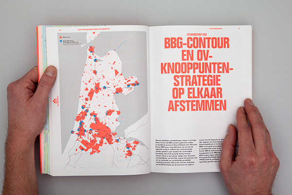
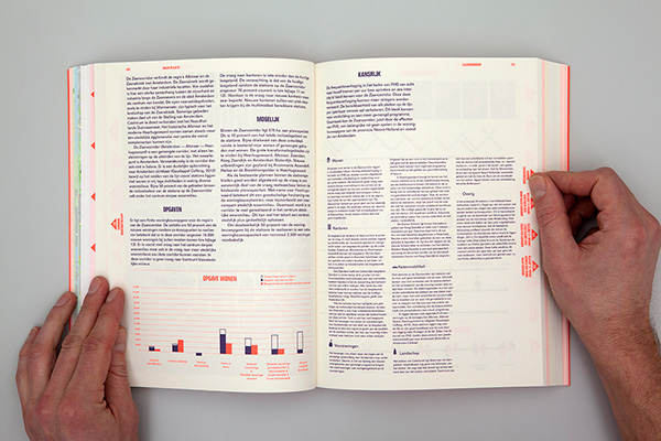
The project required a lot of input from different government parties, which led to lengthy internal discussions about the visual identity - there were a lot of existing norms to consider and we were pushing for something that challenged the existing graphical style.
We wanted to create something that not only activated the audience in a visual sense but also made the data really accessible and understandable - this was our real challenge. We felt that a new graphic system was necessary to show the level of research to its best degree. In the end, this is something all the parties had in common - wanting to create a language that got people exited about the potential of the research. With the same end-goal in mind, people were more flexible and enthusiastic about our ideas. Our core team, including Shirin Jaffri from the Province of North Holland and especially the Director of Vereniging Deltametropool, Paul Gerretsen, were very important in the collaboration. They showed a tremendous understanding for the iconic potential of the design.
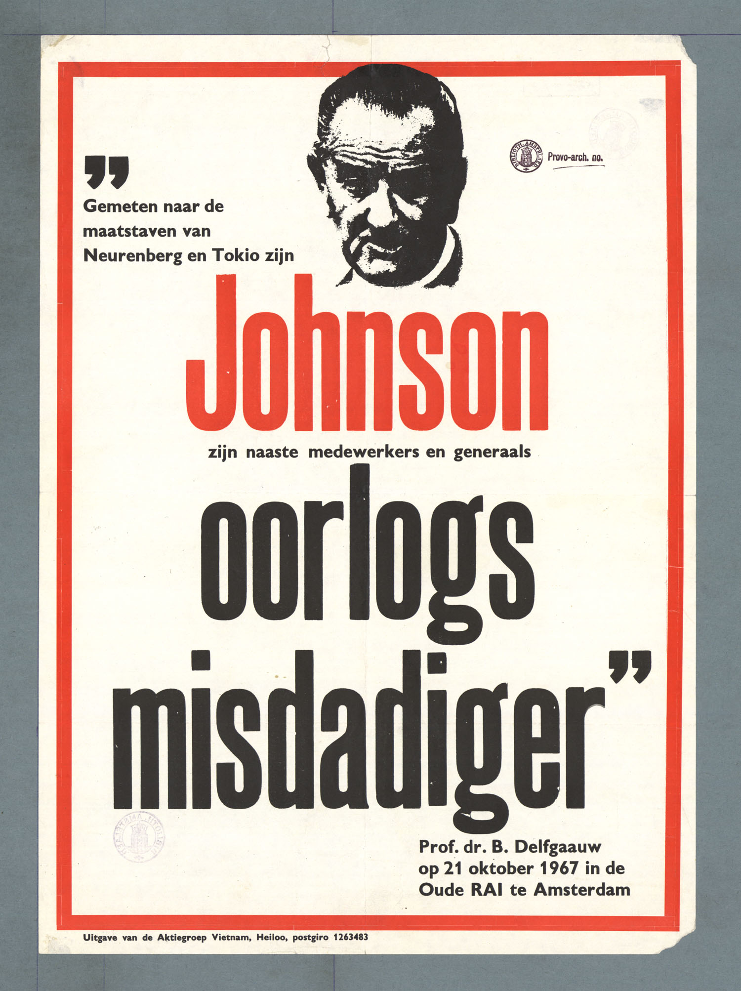
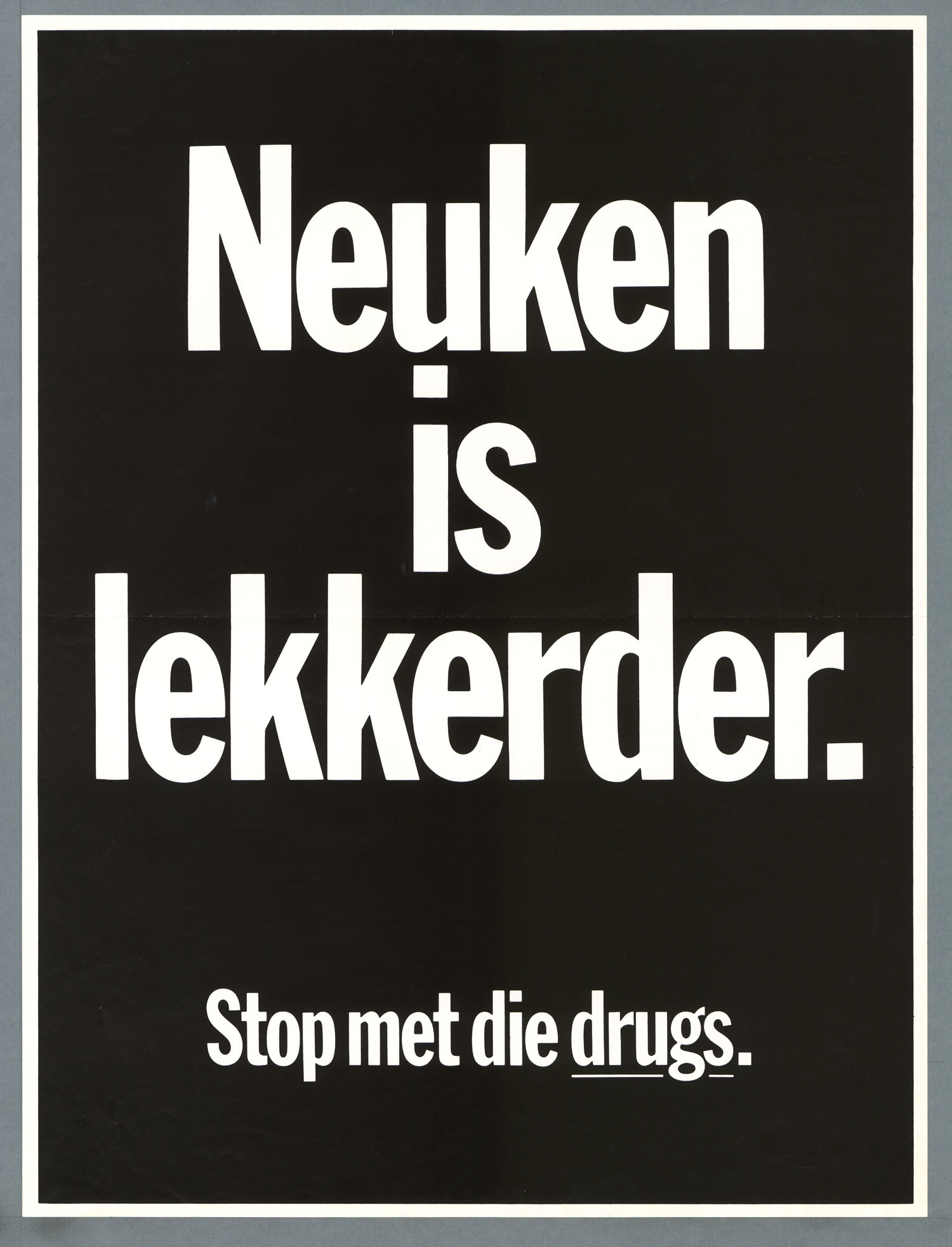
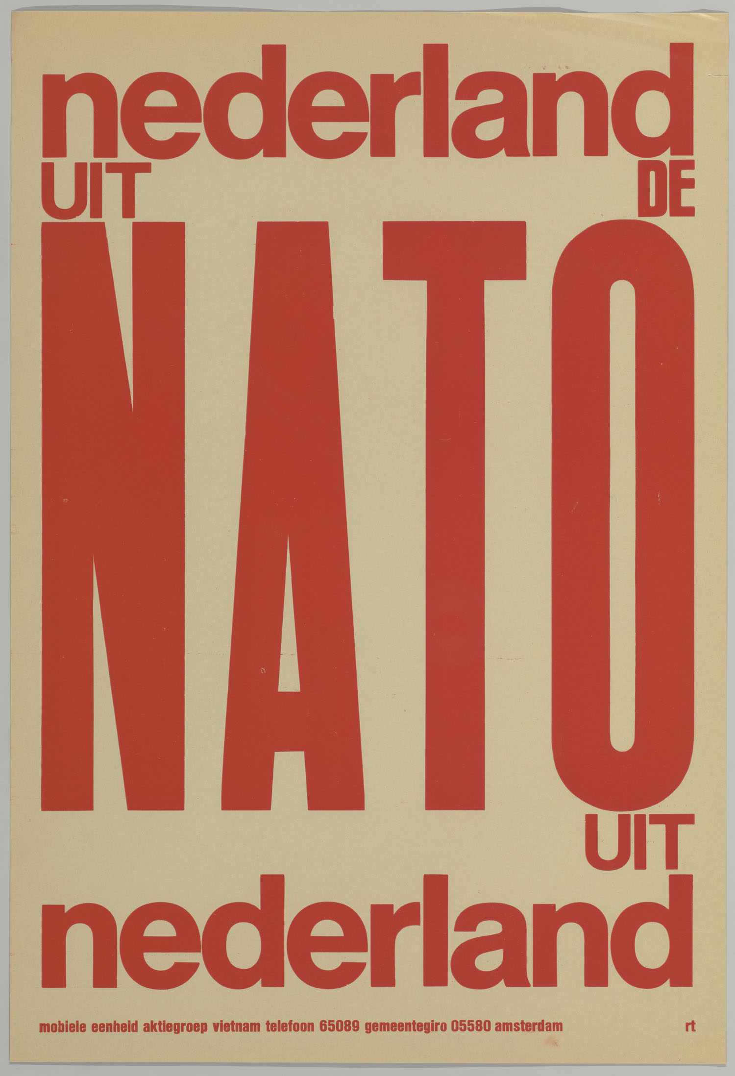
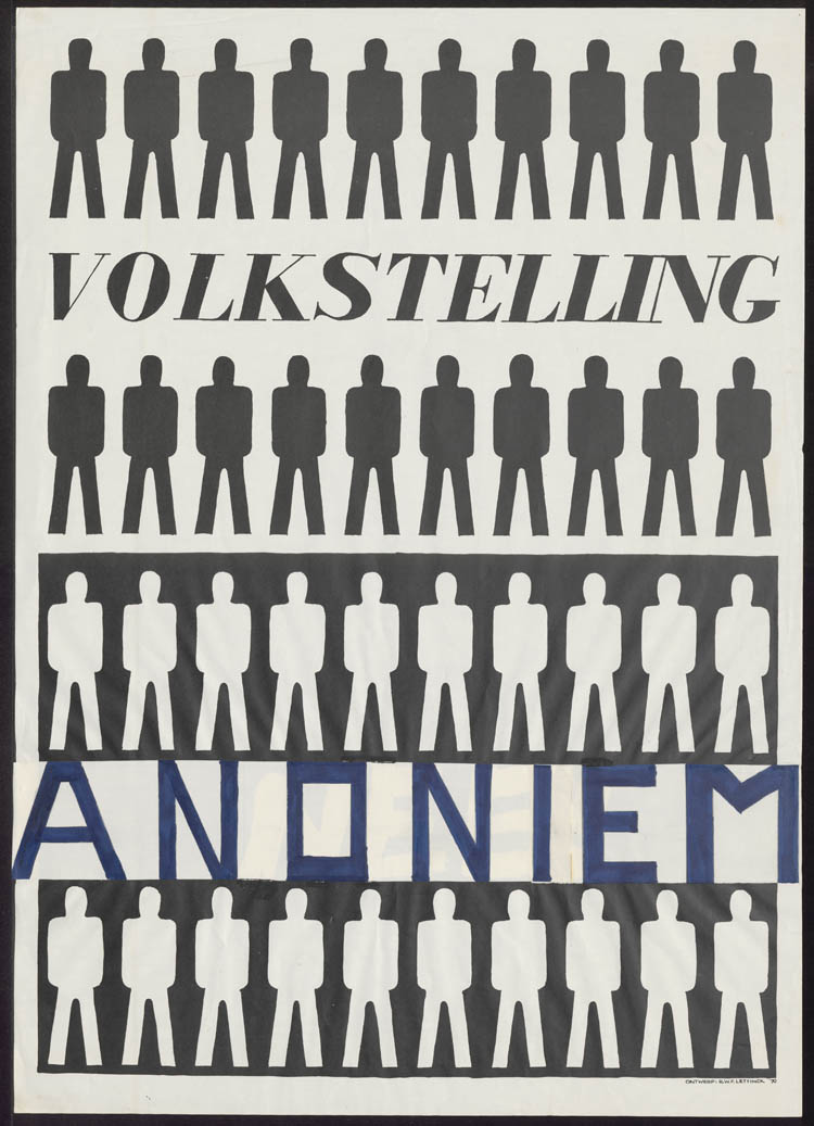
There is a multi-layered motive for using the counter-cultural visual language from the late-60s, early-70s. The first is that this language socially loaded. The current policy-makers in Holland are from our parents’ generation that went to high school or university in this era. The 60’s are also known as the activism-years - a period of liberation, resistance and development of youth-culture. We wanted to stimulate the policy-makers to make new decisions by referencing that era.
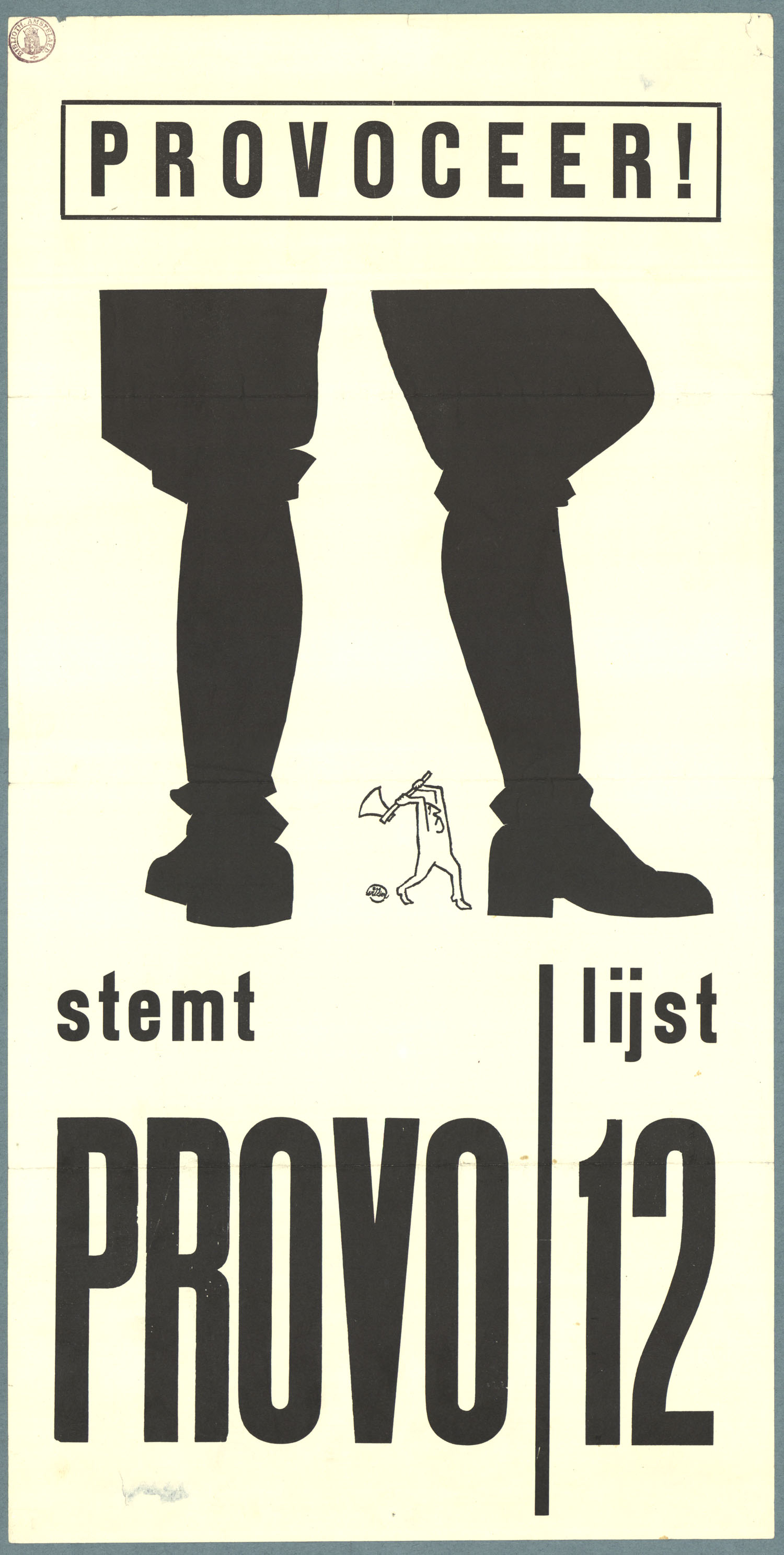
The second reason is purely visual. Provo (“from provoking the authorities”) was one of the larger activist groups from that era. They used posters to distribute their messages. Their visual language was very graphic, bold and iconic, using lots of clear modernistic typography and colours - the Provo poster by Willem Langhout from 1966 is an amazing example. We needed similar visual qualities to create a recognisable and iconic brand.
All together, we wanted to create a product that would not only stand out on a policy-makers desk, but also appeal to his or her inner activist. Referencing 60’s non-conformist visual language in a 21st century design helped us in achieving this goal.
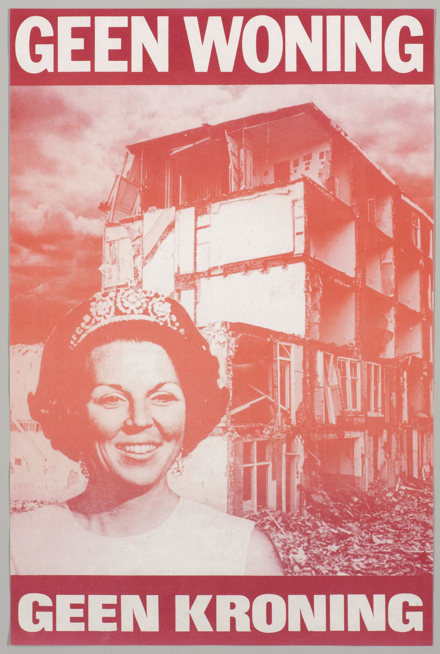
After years of designing, we have built up a library of ideas and visual references in our minds. Alfons has always been interested in how to create an editorial and visual world in which everything makes visually good sense. Florian's core interest focuses on creating recognisable branding resonate throughout every detail of a project. Our collective ideas start from here, with the overall theme of 'activation' guiding the design.
From the beginning, we thought that color-coding the book and brand would become an important element, much like the method old atlases employ. The cross-reference system in the margins of the book makes complex information more accessible, much like this children's books where you can follow your own storyline. And, the 70’s Superstudio works are always a good reference for dealing with utopian architectural collages.
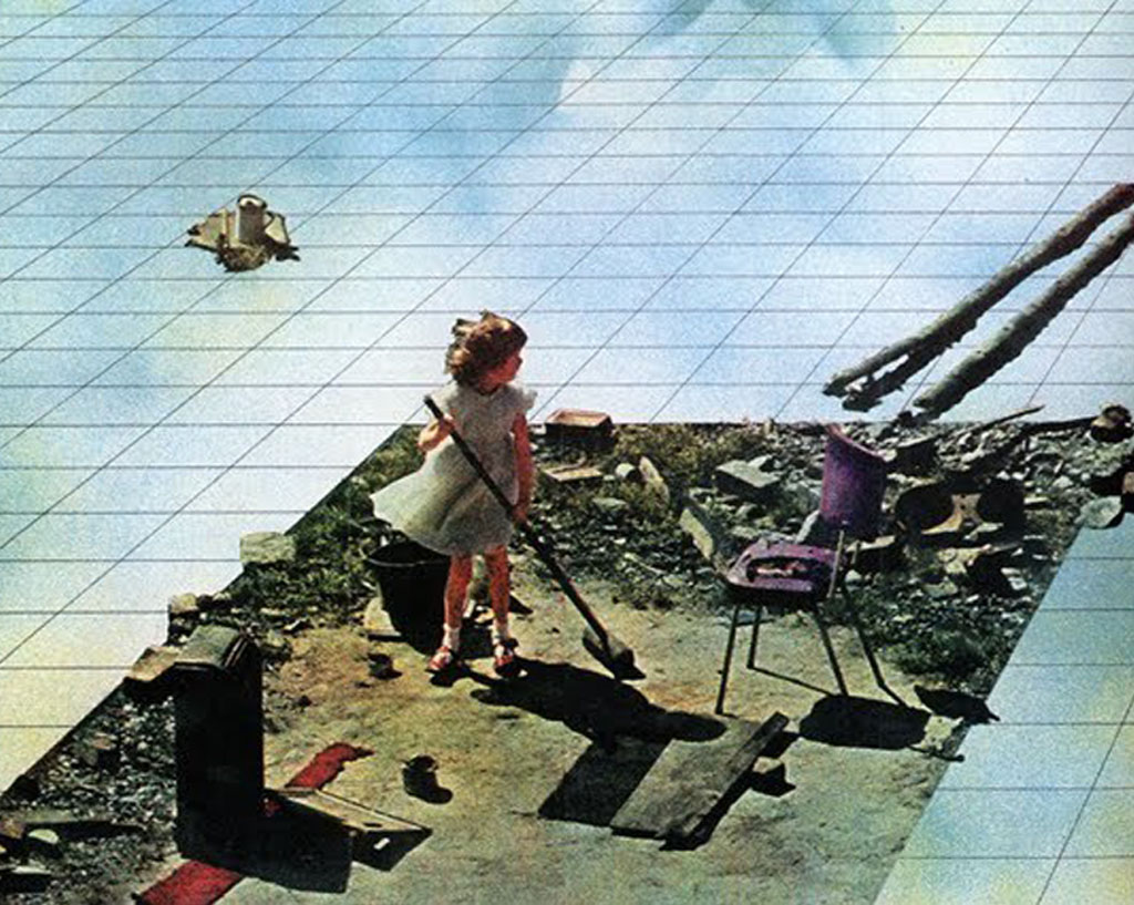
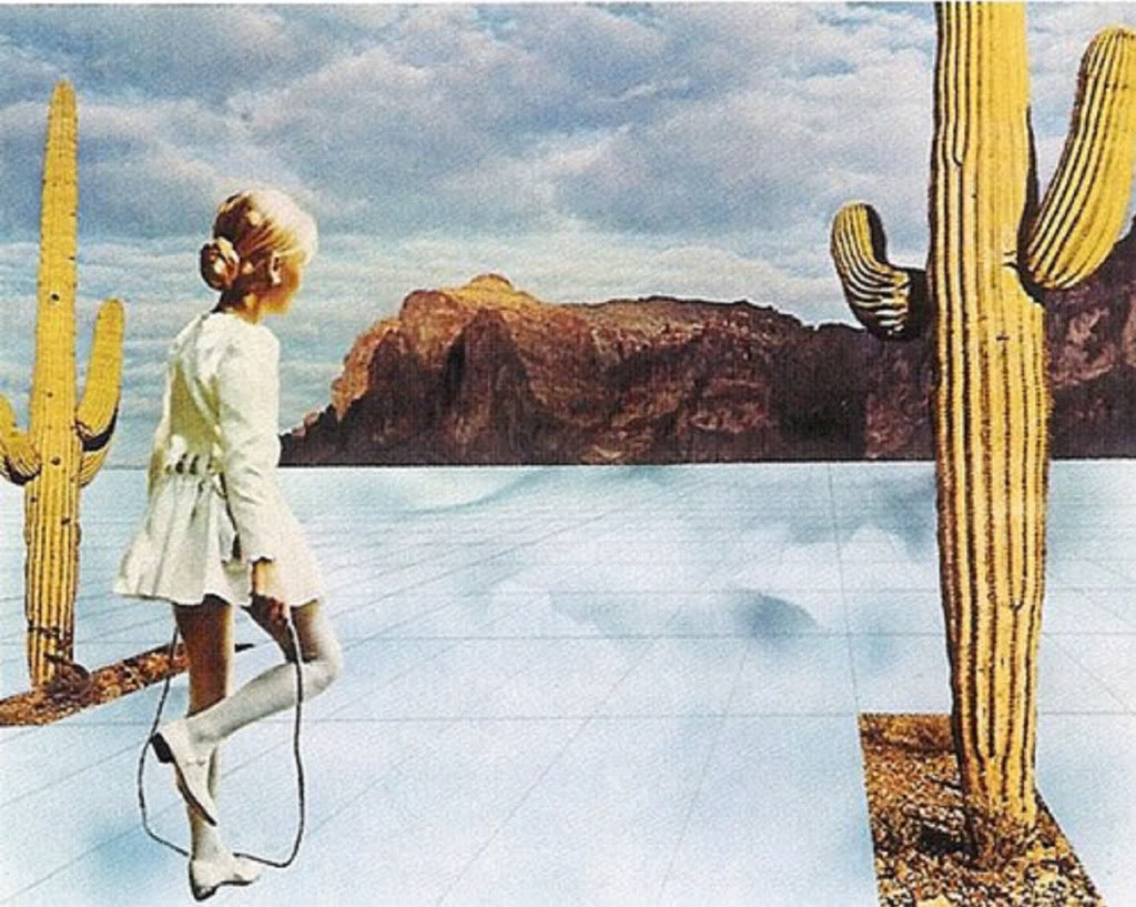
Based on the central idea of activism, we developed multiple proposals at the start of the project. In one proposal, activism led to nationalism, where we explored using national colours, flags, typography etc. We also looked into utopianism as a concept with the over-use of collages, referring to the great utopian architectural publications from the second half of the 20th century. These were all discarded in the earlier stages in favour of the pure poster-like activist approach, where we found the language, typography and colour more akin to our graphical vision.
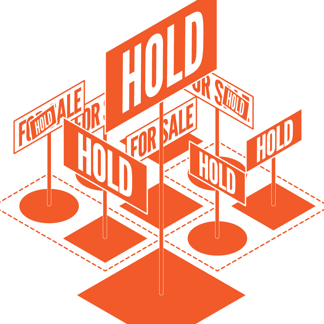
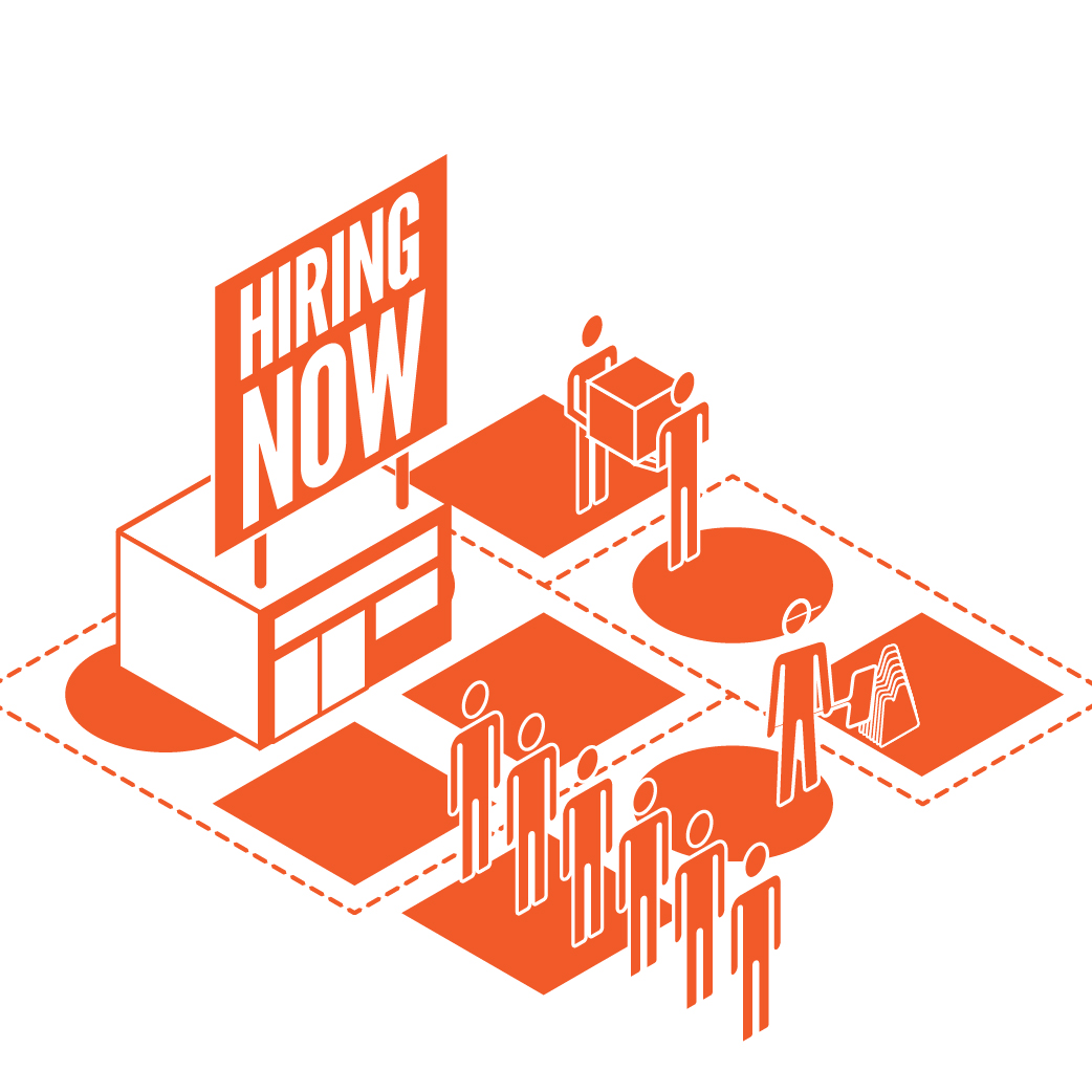
Knowing that our audience - policymakers - is mostly interested in the research-results, we focussed on making the content very accessible. The development of the visual language happened alongside the development of the content of the book. As the content developed and changed, so did the brand. The toughest job was to visually connect the 150 diagrams, 200 maps, groups of iconography, texts, tables, and collages all within one brand that works in a book, at a conference and any future applications.
The visual language was created both top-down from a branding-perspective as well as bottom-up from an editorial and info-graphic perspective. The synergy between the two became Maak Plaats!
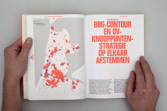
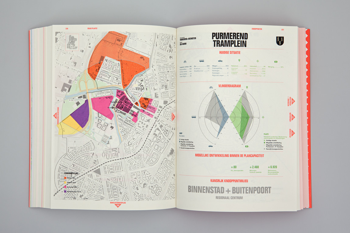
The most successful element of the project is a result of the most challenging part of the project: marrying the governmental and scientific content of the project with a strong and iconic visual identity, without compromising on content or design. Creating a strong design that works in a political and scientific realm is where we've been successful. Maak Plaats! is a test case on how to mary recognisable brands with explanations and visualisations for complex scientific research-projects.
One important function of design is to marry recognisability with explanations and visualisations for complex information-structure. By doing so, complex information can be communicated in an understandable and iconic way to both stakeholders as well as the general audience. Already we see this marriage happen in organisations that advise governments. Much like Vereniging Deltametropool, these organisations - in our experience both in The Netherlands as well as in the US - appreciate the clarity and iconic qualities a designer can bring to a project. For us, one of the future challenges and opportunities is to bring design strategies into a brought political and science world.
